It’s Baked In
CLIENT: TATE’S BAKE SHOP
LOCATION: NEW YORK
PROJECT TYPE: CAMPAIGN DESIGN
For this pitch, another designer and I collaborated to reimagine the visual identity of Tate’s, aiming to evolve the beloved cookie brand into a more modern, energetic space—while keeping its recognizable charm intact.
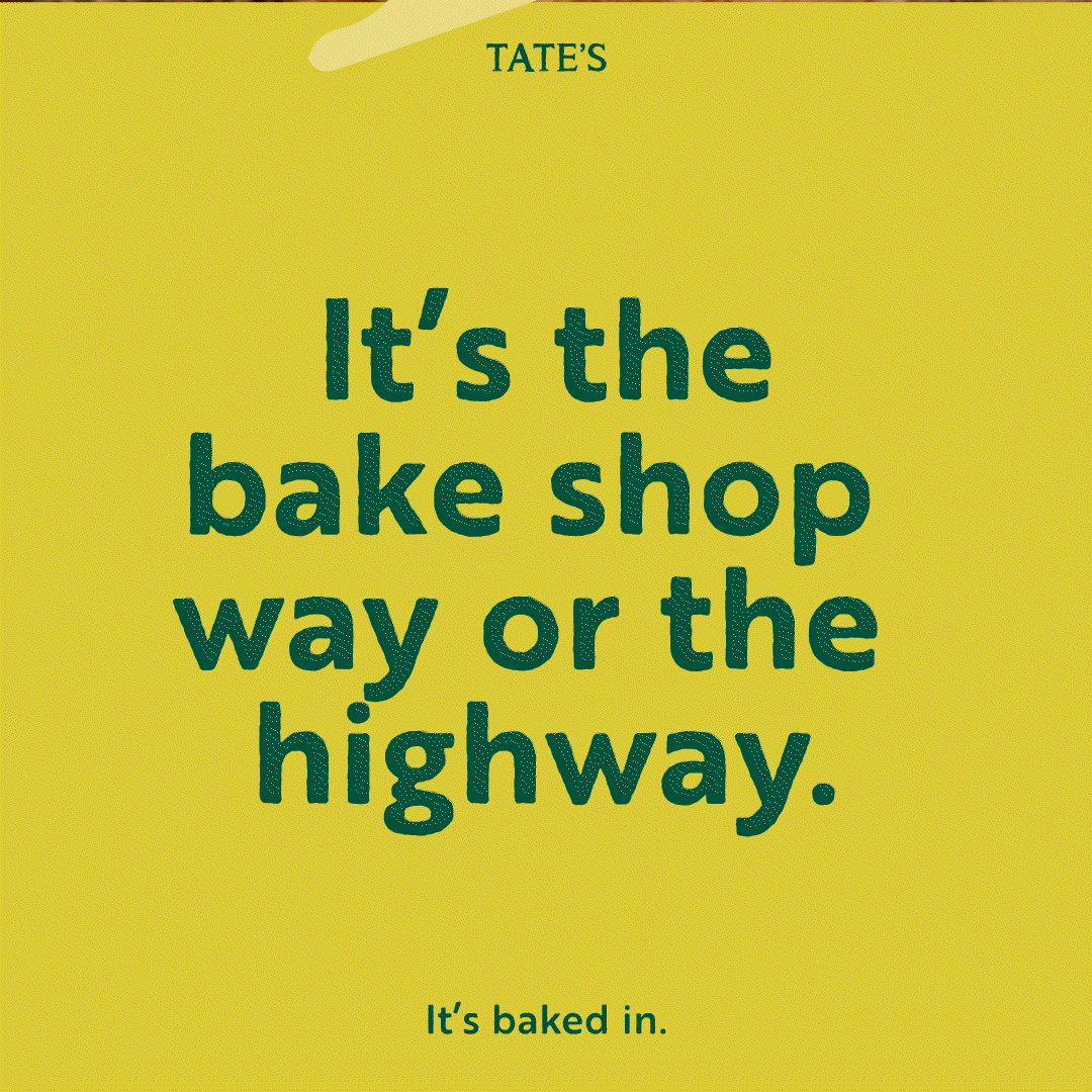
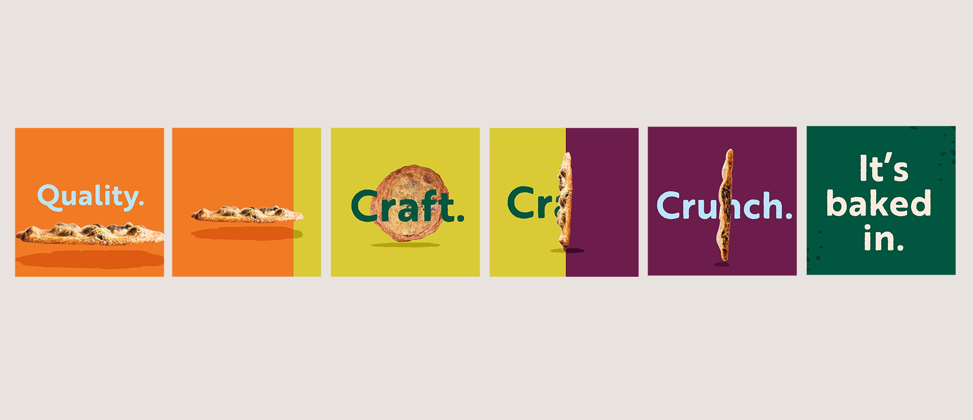
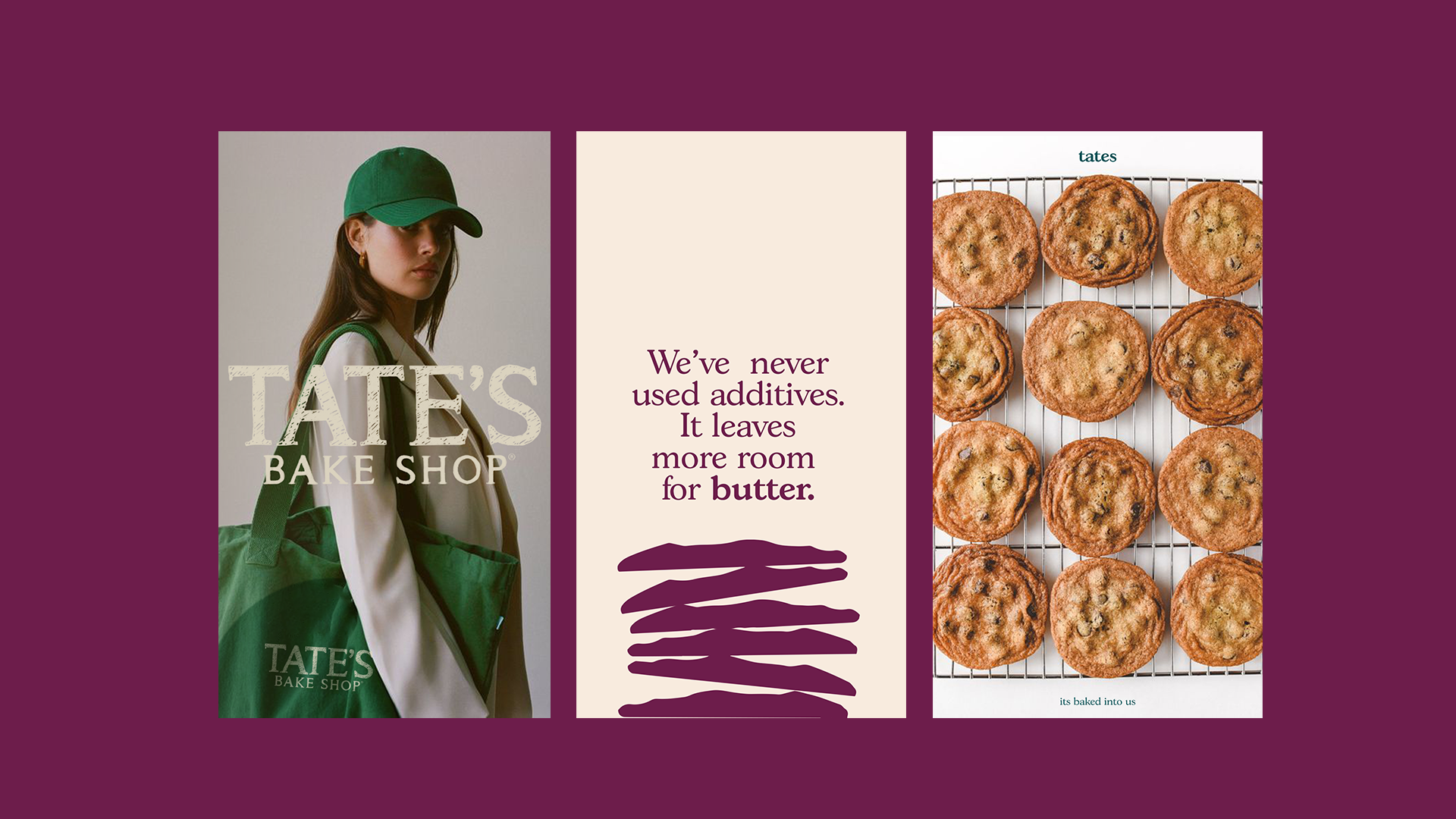
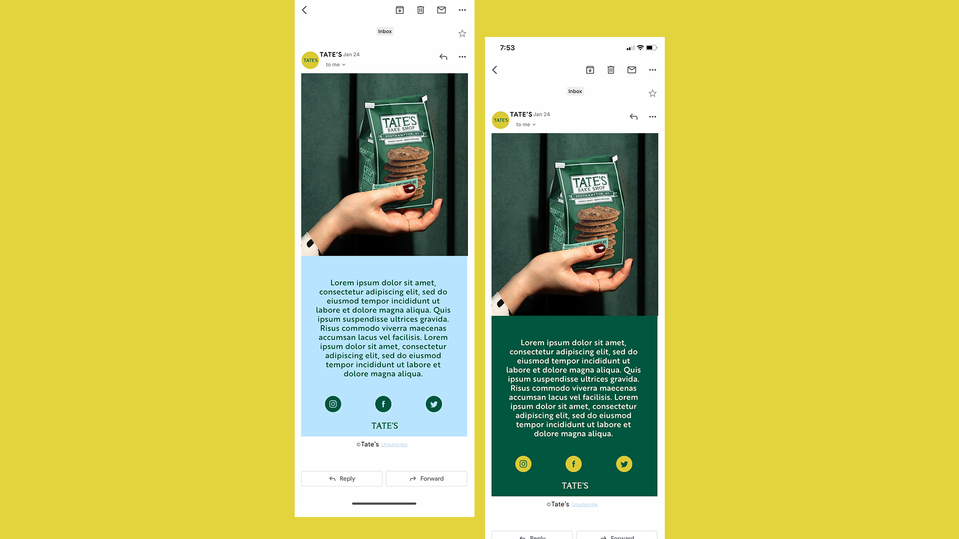
We developed a bold, dynamic design system full of movement and color, shifting away from the traditional look to something more expressive and youthful. The new direction featured vibrant pops of color, layered graphics, and lively compositions to reflect the brand’s growing personality and presence in pop culture.
As part of the redesign, we also proposed an updated logo—cleaner, more contemporary, and better suited for digital and social spaces—while maintaining key elements that make Tate’s iconic. The system was built with flexibility in mind, making it easy to scale across packaging, campaigns, social content, and in-store moments.
The result was a fresh visual world that felt playful, craveable, and elevated, setting the stage for Tate’s to connect with a new generation of cookie lovers without losing its heritage.