Crack the Claw
CLIENT: WHITE CLAW & NETFLIX
LOCATION: NEW YORK
PROJECT TYPE: CAMPAIGN DESIGN | PACKAGING DESIGN | LOGO DESIGN | PRINT DESIGN
For this cross-brand campaign, we partnered with Netflix’s Glass Onion to create a limited-edition mystery drinking game called Crack the Claw—bringing together the worlds of suspense and social fun under the White Claw brand.
The campaign was a full-scale creative undertaking. Our team developed everything from the game logo and packaging to the rulebook layout, social assets, and digital rollout. The tone of the campaign needed to strike a balance between intrigue and playfulness, tapping into the film’s murder mystery energy while staying true to White Claw’s laid-back spirit.
My focus was on three core elements:
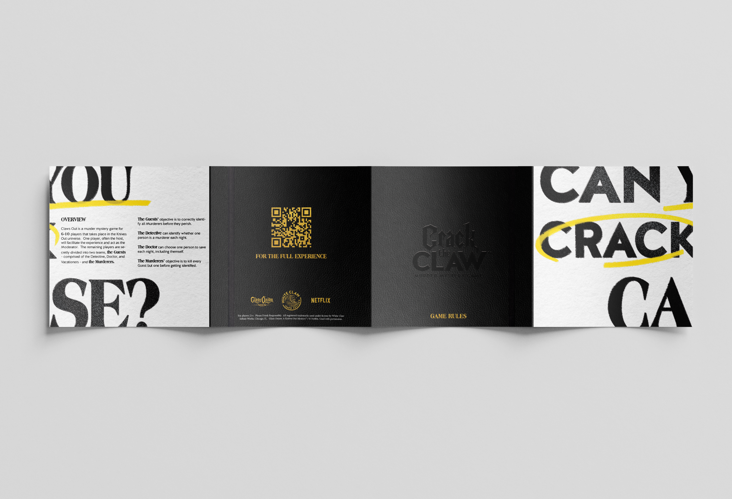
Logo Design – A bold, playful lock-up that blended the Glass Onion aesthetic with White Claw’s graphic style, designed to stand out both on-pack and in social environments.
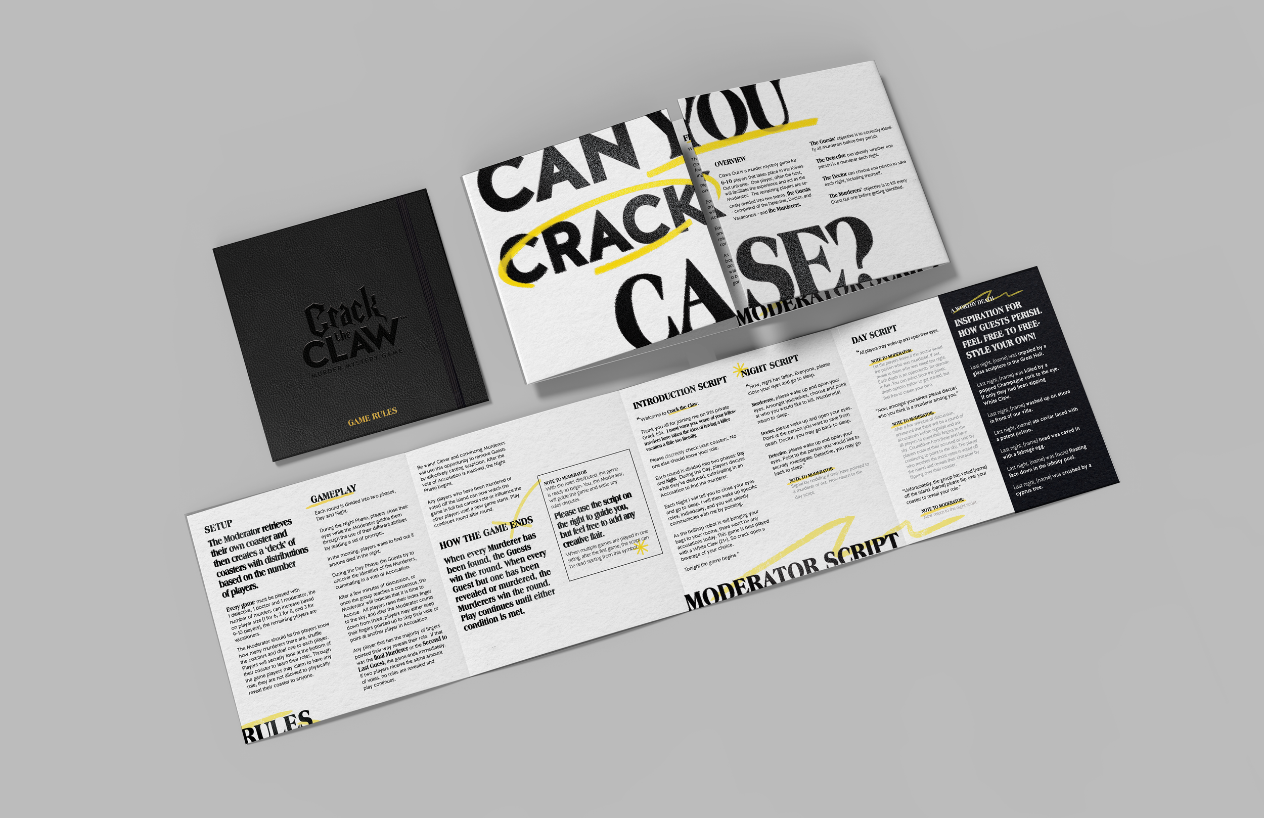
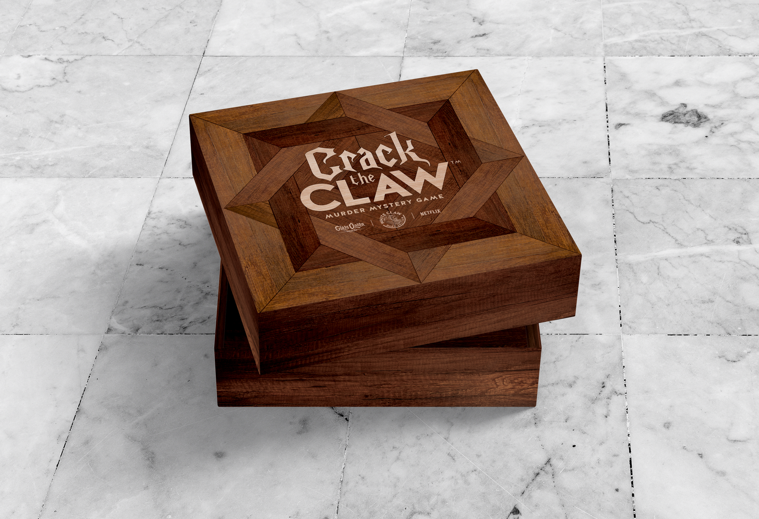
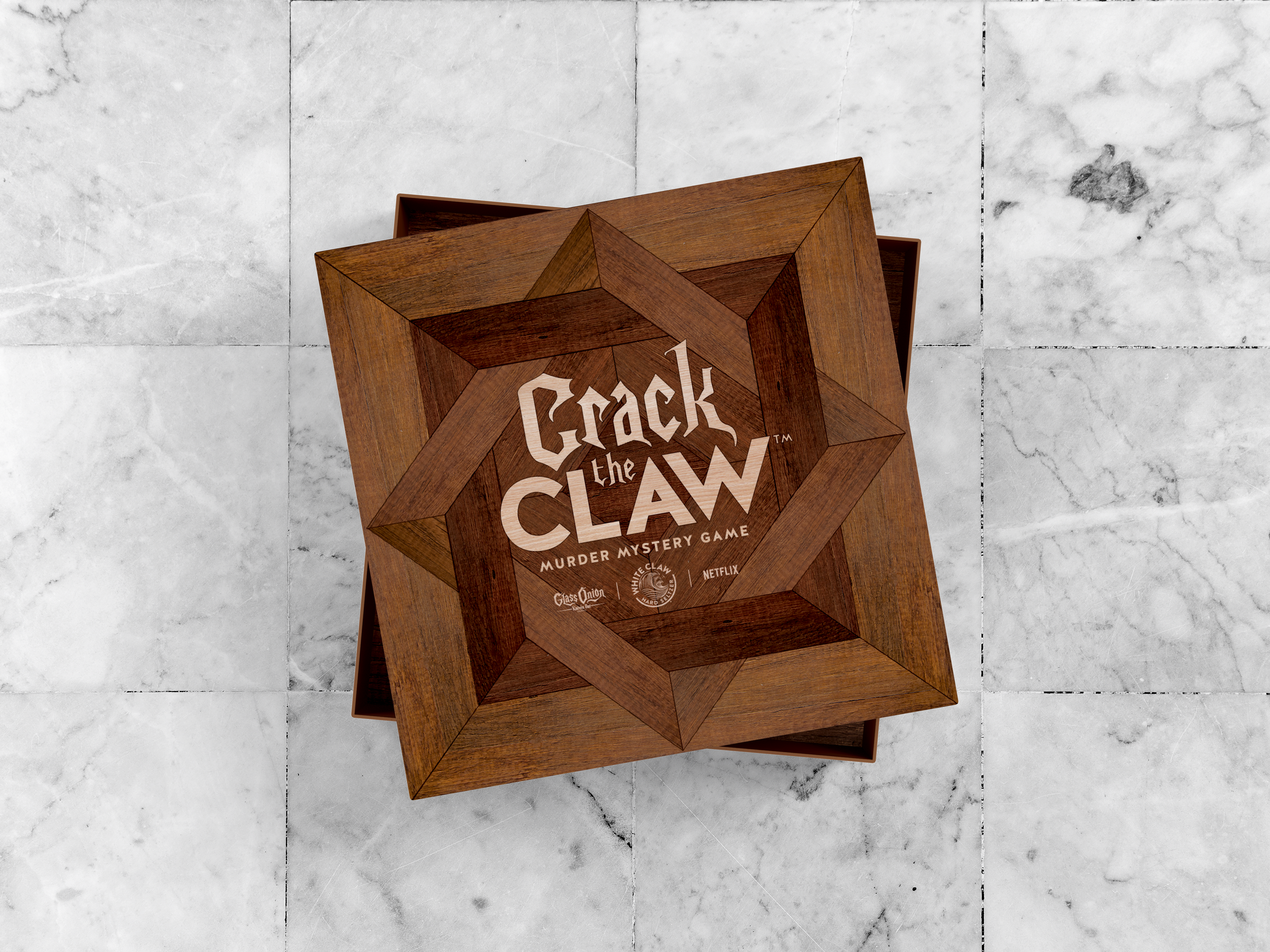
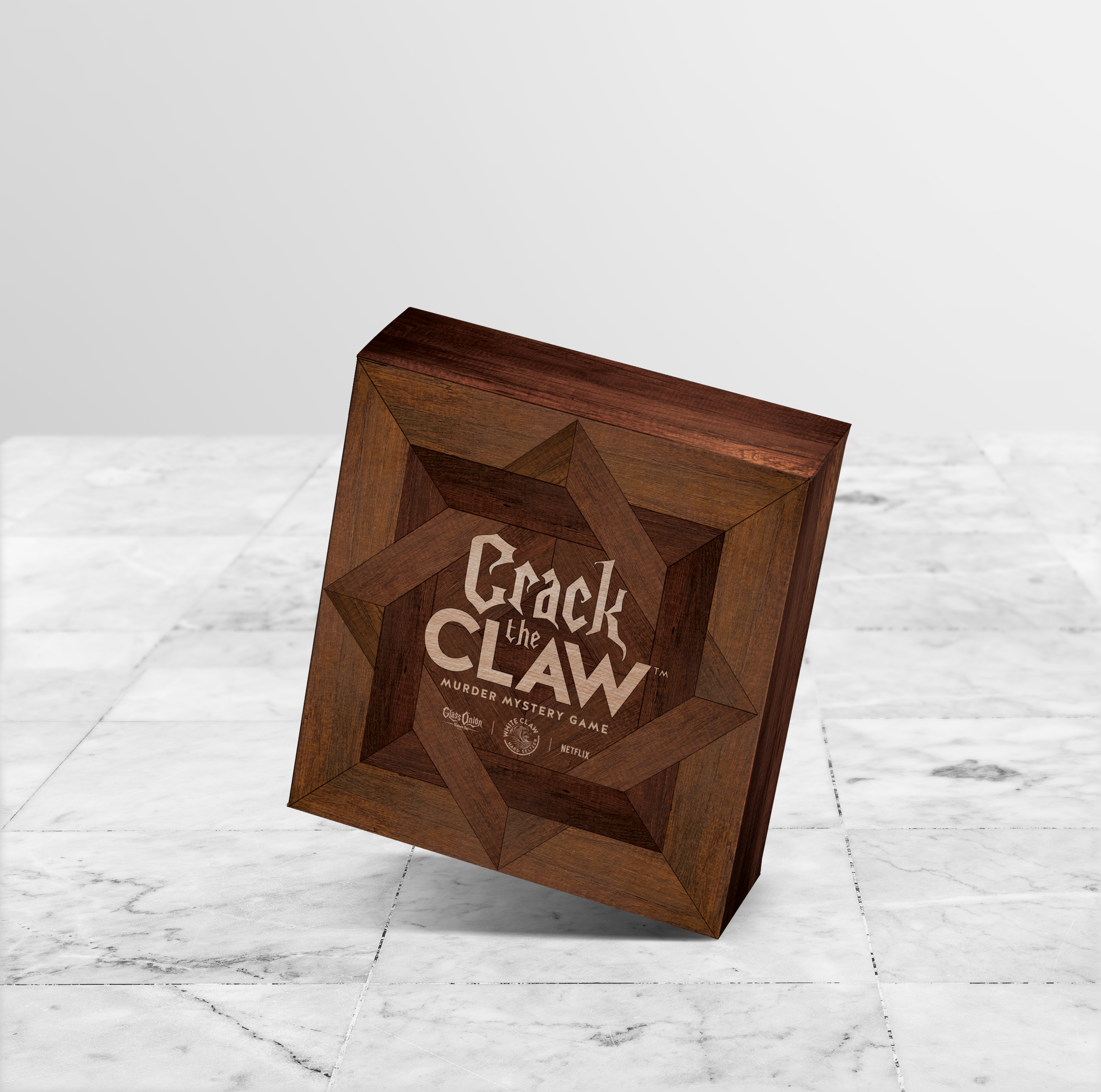
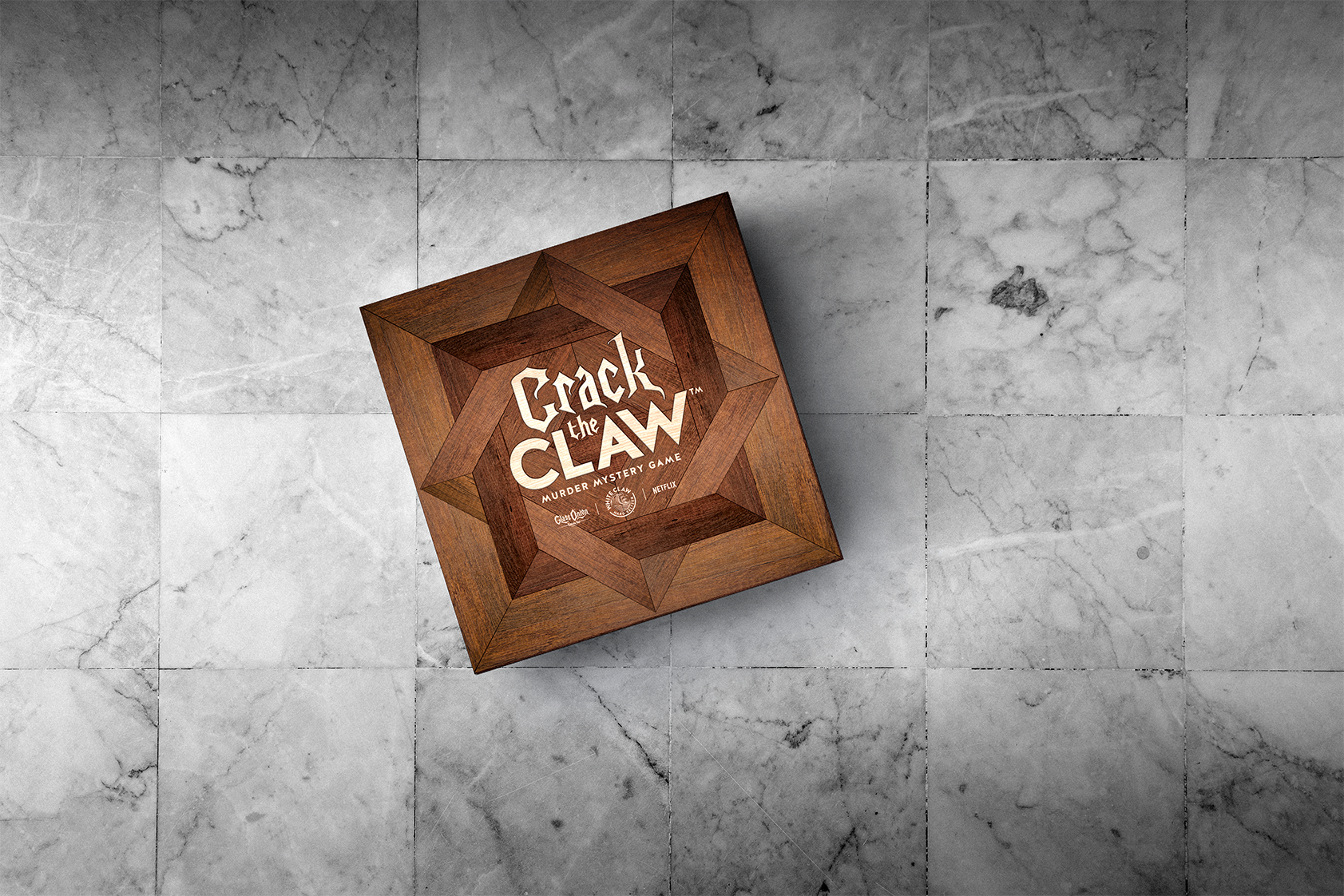
Packaging Design – I led the visual development of the game box and components, combining sleek, mysterious graphics with energetic color and texture to reflect both brands.
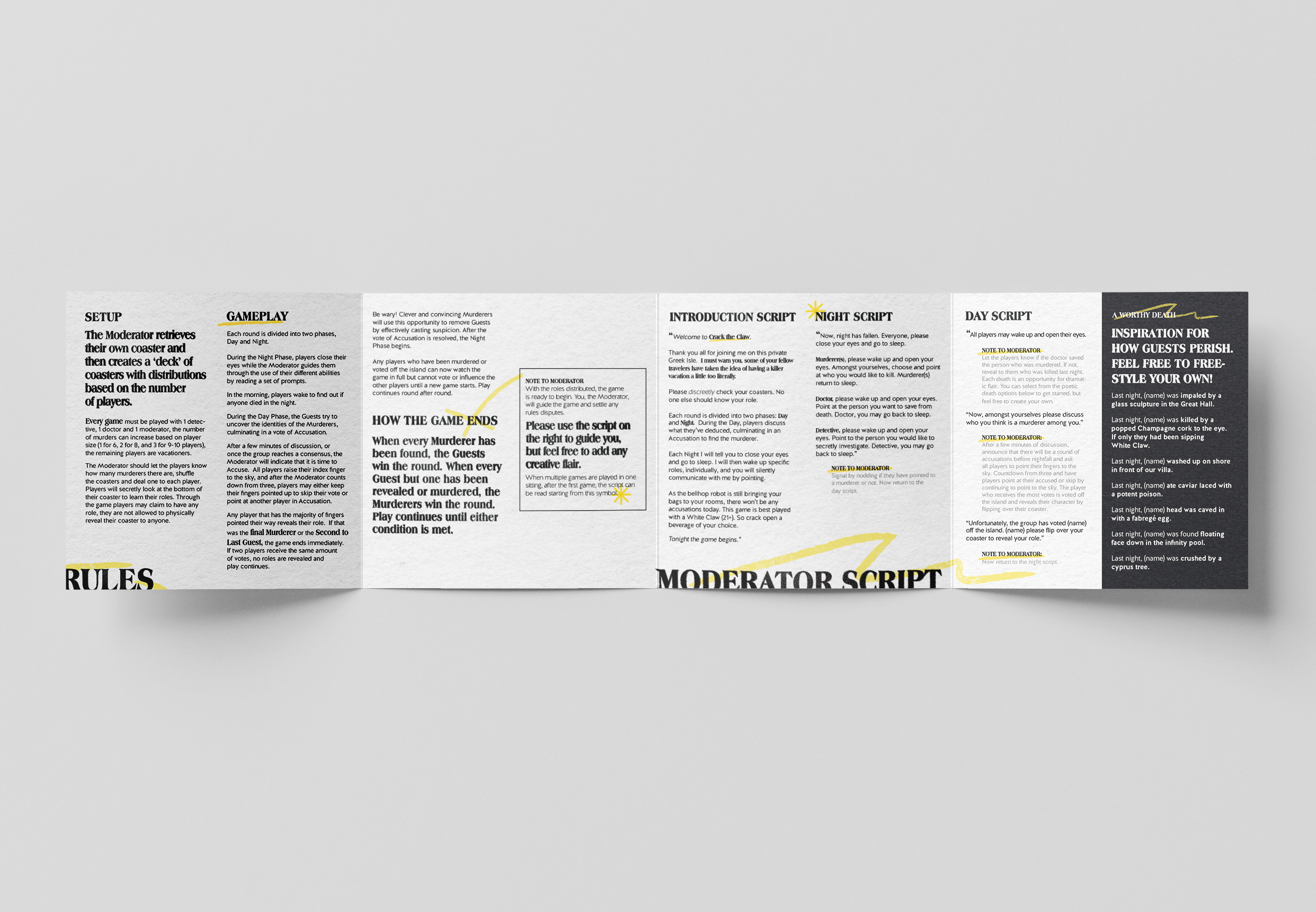
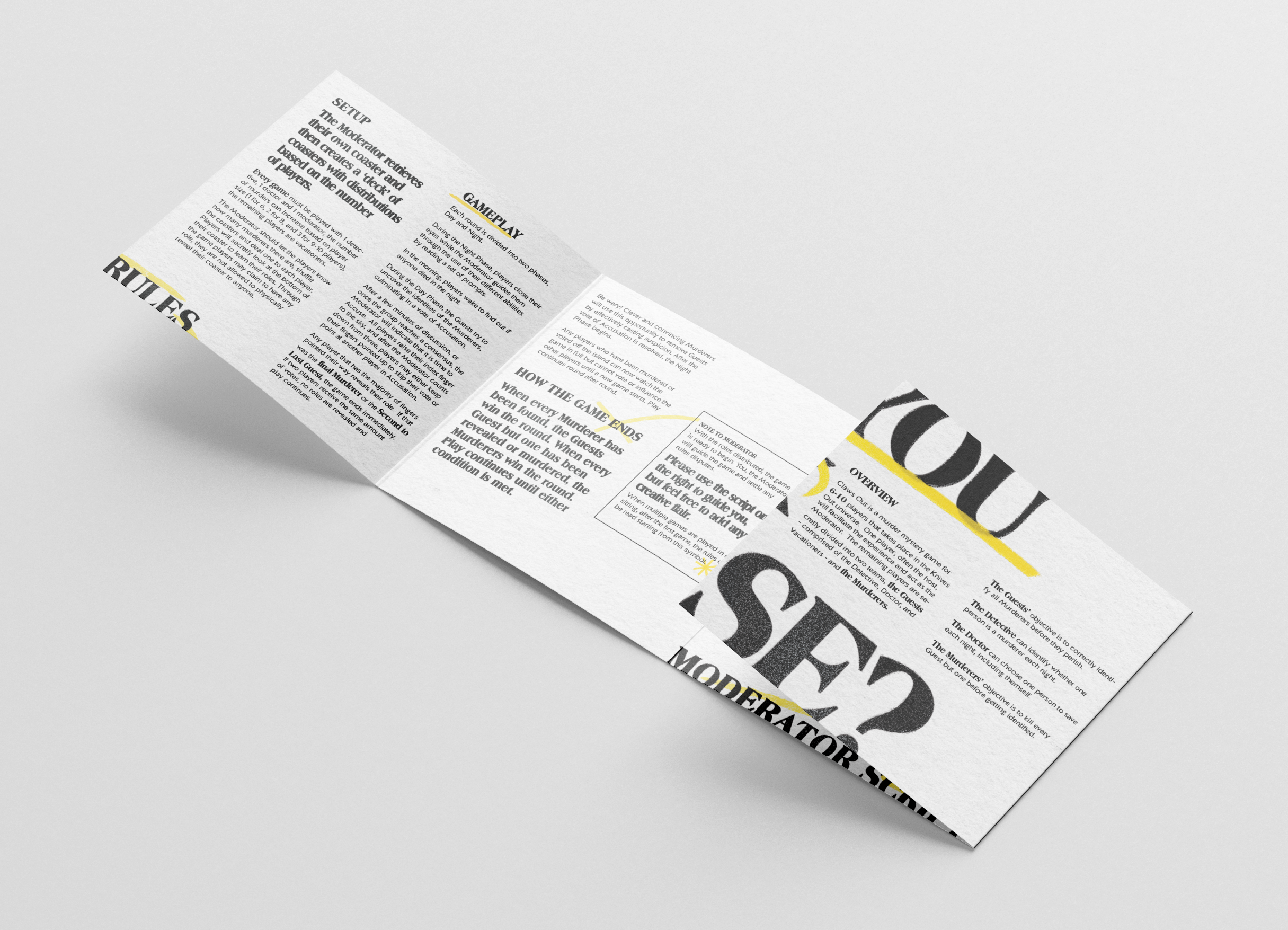
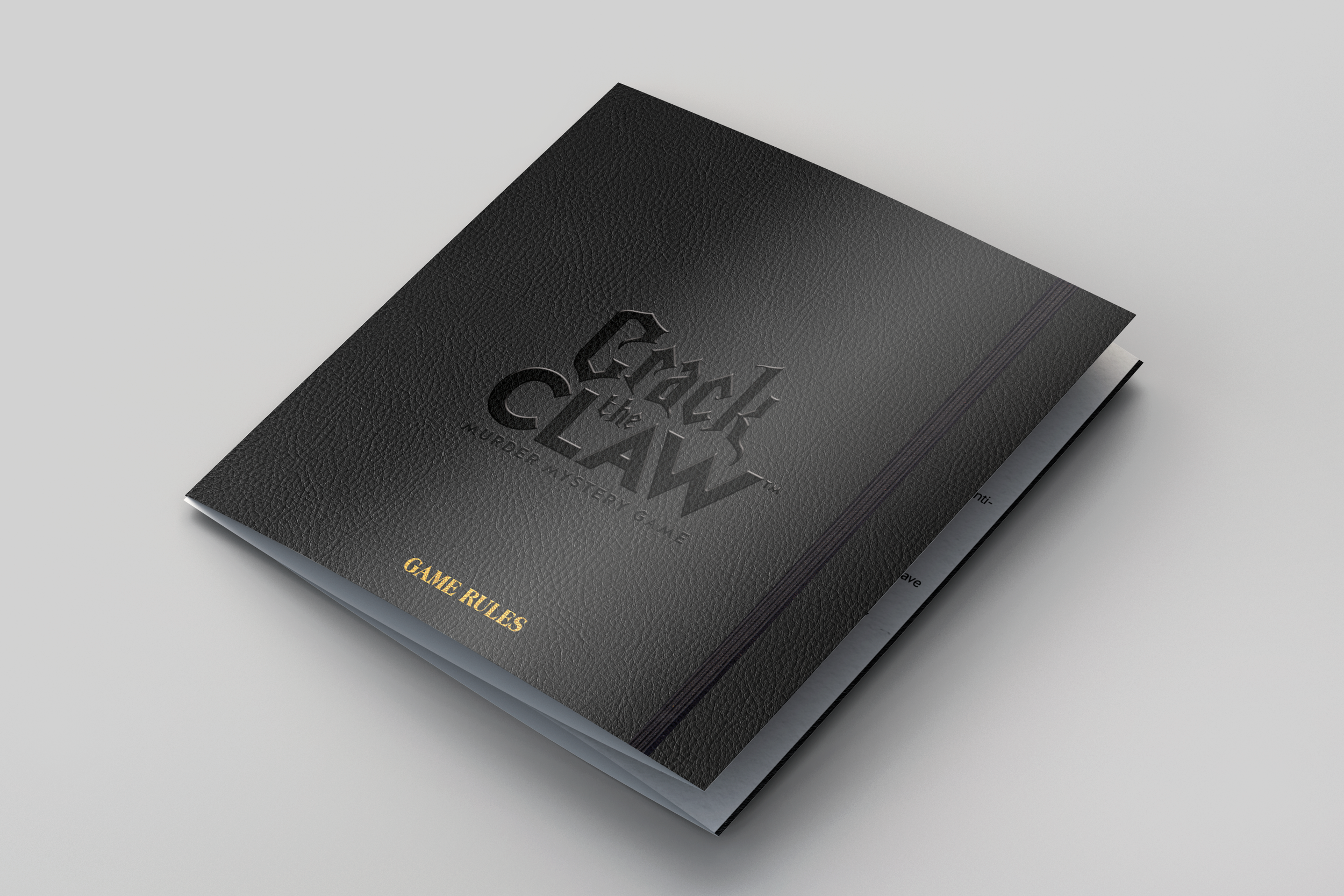
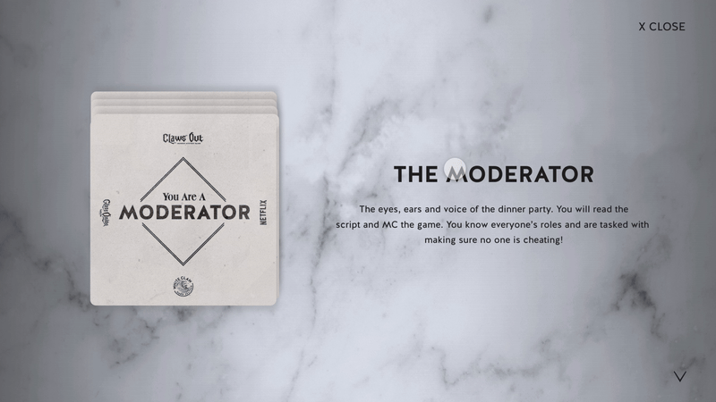
Rulebook Layout – I designed the full rulebook experience, from typography and layout to iconography and visual cues—making it both easy to navigate and thematically on-brand.
The result was a cohesive, immersive campaign experience that felt cinematic, unexpected, and genuinely fun—a creative twist on product + entertainment that engaged both White Claw fans and Netflix viewers.


Early versions of the logo

02

03

04

05
Packaging

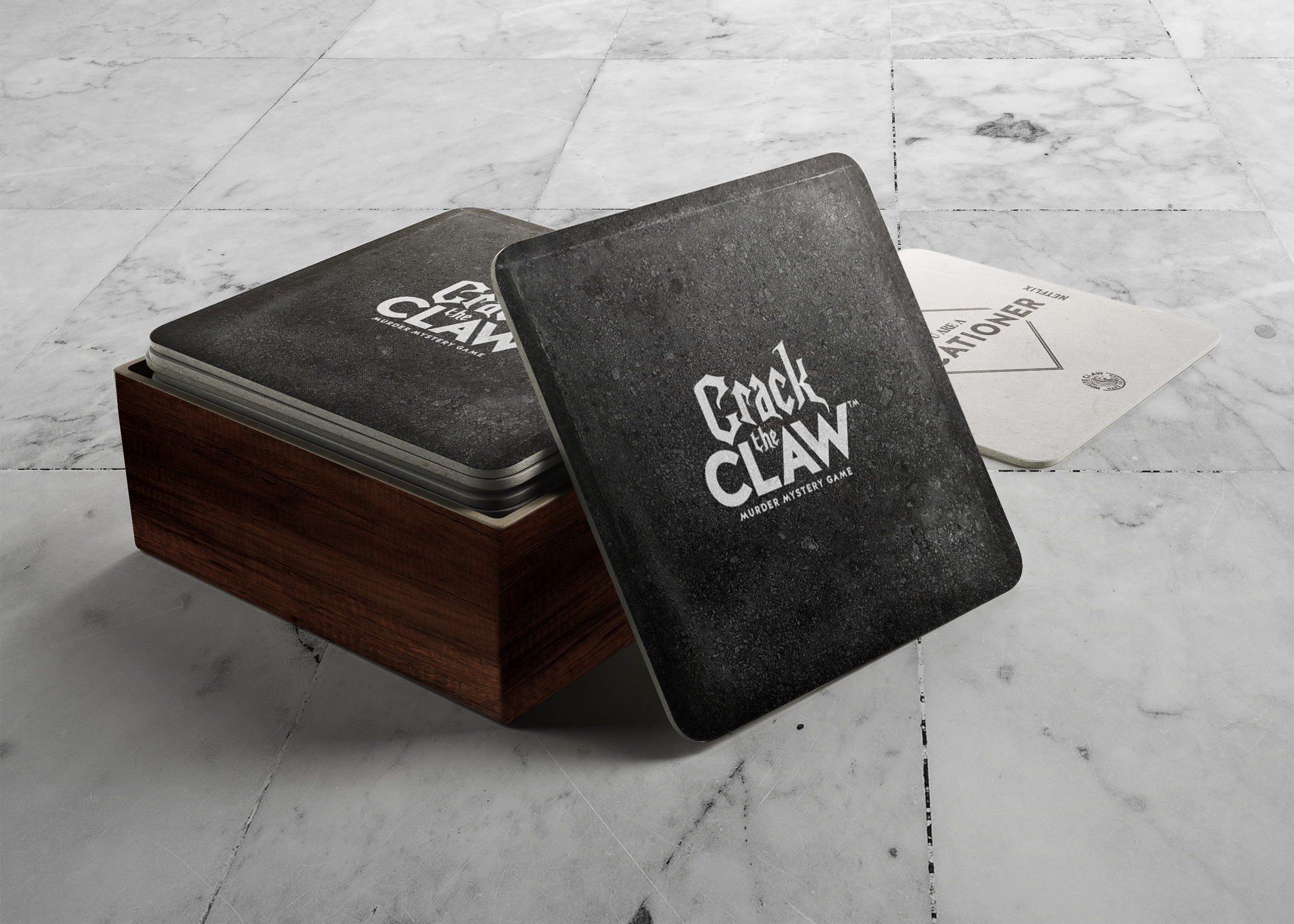
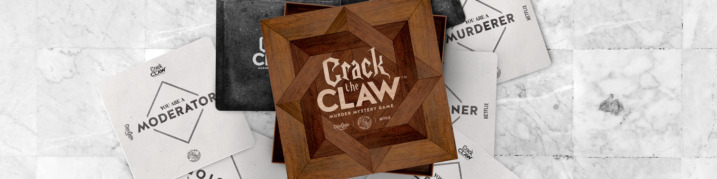
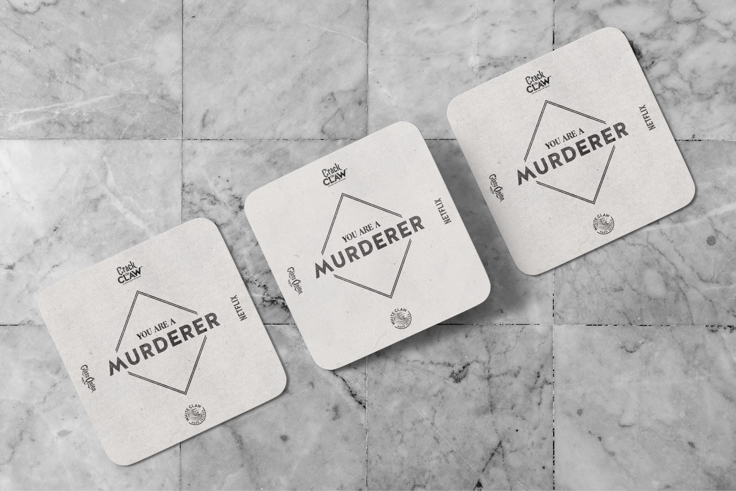
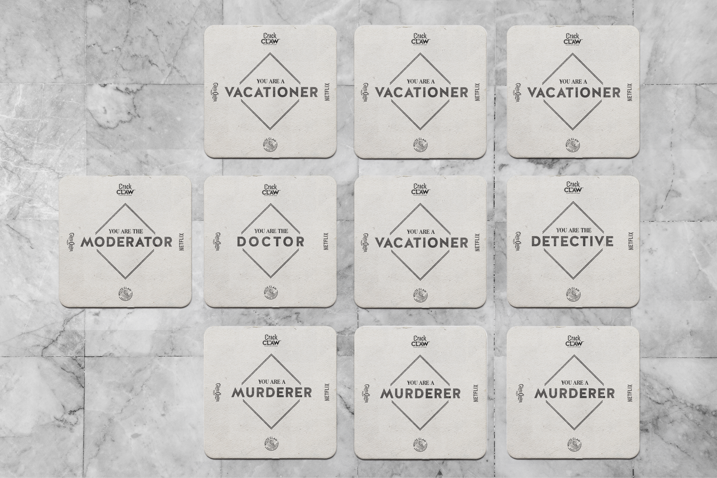
Game cards | Coasters

Rule Book Layout