Claw Back your Summer
CLIENT: WHITE CLAW
LOCATION: NEW YORK
PROJECT TYPE: CAMPAIGN DESIGN SYSTEM AND IDENTITY
For White Claw’s Claw Back Your Summer campaign, the core idea was simple but powerful: give people the chance to reclaim their time off and truly disconnect. The campaign invited participants to enter for a chance to win a range of prizes—from an intimate dinner for two to a full-blown, all-expenses-paid escape to a remote island. It was all about flipping the switch from work mode to vacation mode.
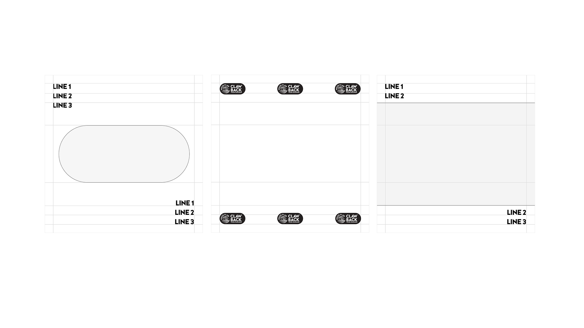
To bring this concept to life, we designed a campaign logo inspired by a toggle switch, symbolizing the shift from daily grind to full summer freedom. From there, I built a bold and structured design system around a pill-shaped logo mark, using a strong grid layout that created a sense of departure from routine—like stepping out of reality and into your best summer yet.
A major turning point in the campaign's visual identity was our decision to incorporate color photography—a notable departure from White Claw’s traditionally black-and-white brand aesthetic. We believed that to truly sell the energy of summer, the visuals needed warmth, light, and life. The client embraced the shift, recognizing that this campaign needed to stand out and feel expansive, free, and vibrant.
In addition to the brand identity and visual system, I also designed the landing page, email marketing assets, and social media content, ensuring a cohesive experience across every touchpoint.
The result was a campaign that felt like a breath of fresh air—both for the audience and for the brand itself—capturing the essence of what it means to claw back your time and make summer your own.