SuperRigs 2025
CLIENT: SHELL ROTELLA
LOCATION: NEW YORK
PROJECT TYPE: BRAND IDENTITY DESIGN
CREATIVE DIRECTION: CREATE A LOGO/DESIGN SYSTEM THAT INCORPORATES THE THEME: STYLE AT THE SPEEDWAY
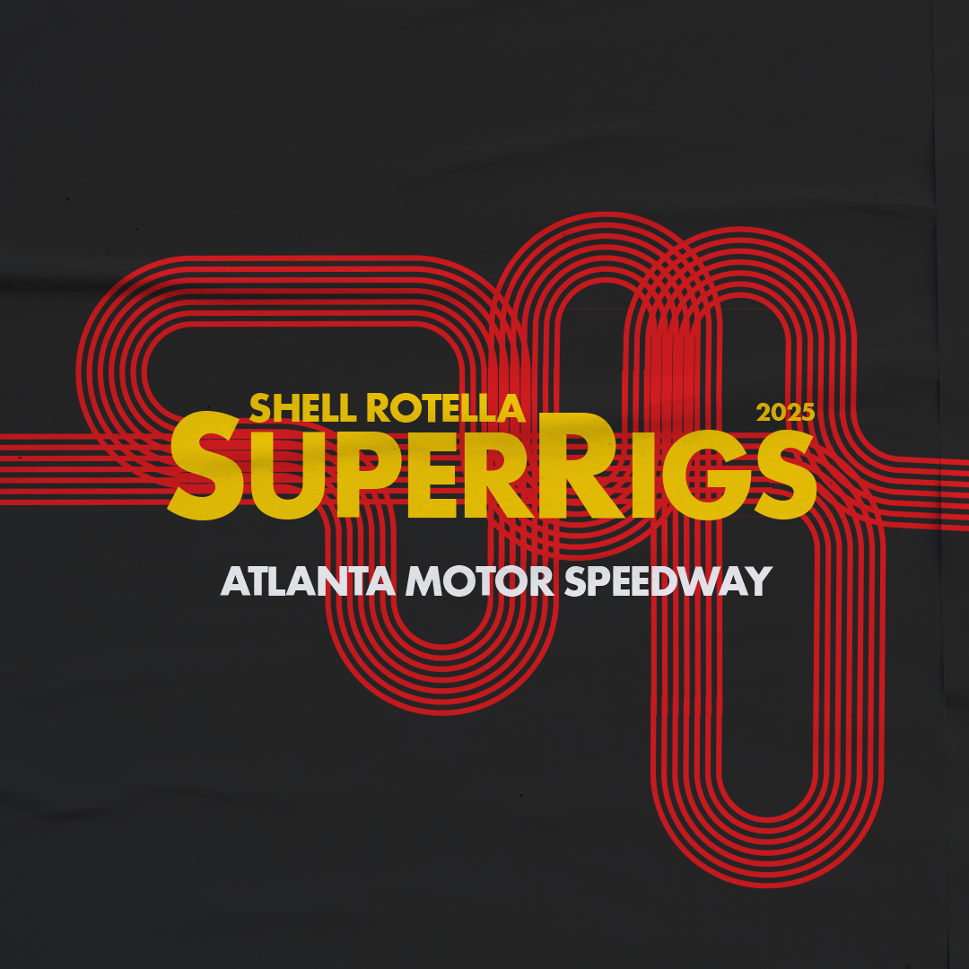
Following my work on the SuperRigs 2024 campaign, I was once again brought on to develop the brand identity for SuperRigs 2025. In 2024, we presented two creative directions—one rooted in a Texas-inspired visual language, and another built around a high-energy speedway theme. While the Texas direction was selected last year, the client was eager to revisit the speedway concept for 2025, aligning with this year’s event location in Atlanta.
For this year’s identity, I leaned into speed, motion, and bold geometry, creating a custom logo inspired by the curves and layout of a racetrack. The mark incorporated strong linear elements and directional angles that captured the dynamic energy of motorsports while still staying grounded in the SuperRigs aesthetic.
The design was well-received by the client, who felt it struck the perfect balance between thematic relevance and visual impact. The logo became the foundation for a wider visual system built with graphic, high-contrast elements and an assertive tone that could stretch across everything from event signage and merchandise to digital content and social media assets.
SuperRigs 2025 presented a unique opportunity to evolve the brand while honoring concepts seeded in previous years—and it was exciting to see the speedway vision brought to life in a way that felt fresh, purposeful, and perfectly suited to Atlanta.