
That Was Easy
CLIENT: STAPLES
LOCATION: NEW YORK
PROJECT TYPE: CAMPAIGN DEVELOPMENT
CREATIVE DIRECTION: HIGHLIGHT THE ICONIC EASY BUTTON
For this campaign, I was tasked with reimagining Staples’ iconic “Easy” brand idea in a fresh, modern way—bringing new energy to a well-known symbol while reinforcing the core message: Staples makes work easier.
I developed two strategic directions, both rooted in the legacy of the Easy Button, but approached through distinct creative lenses:
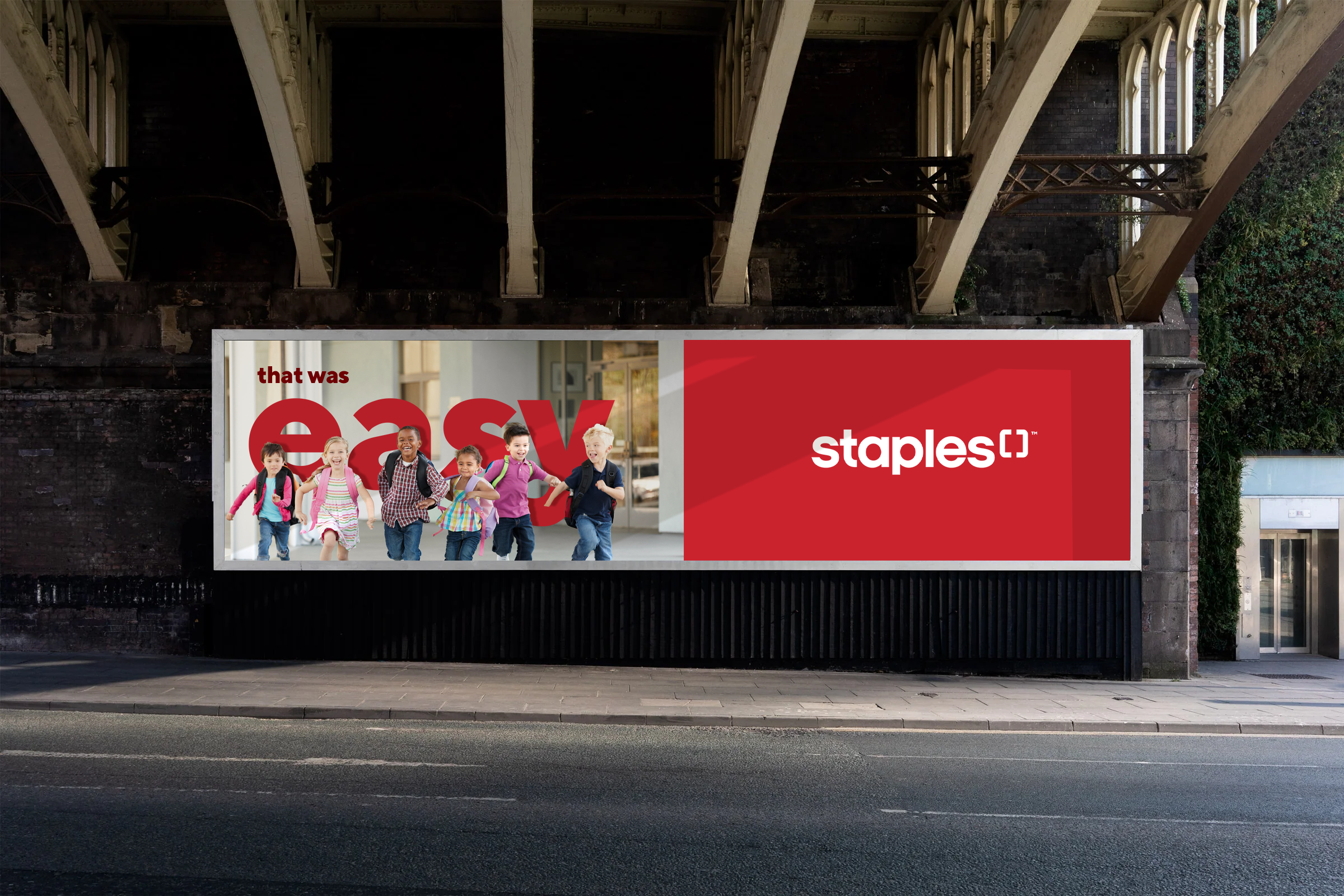
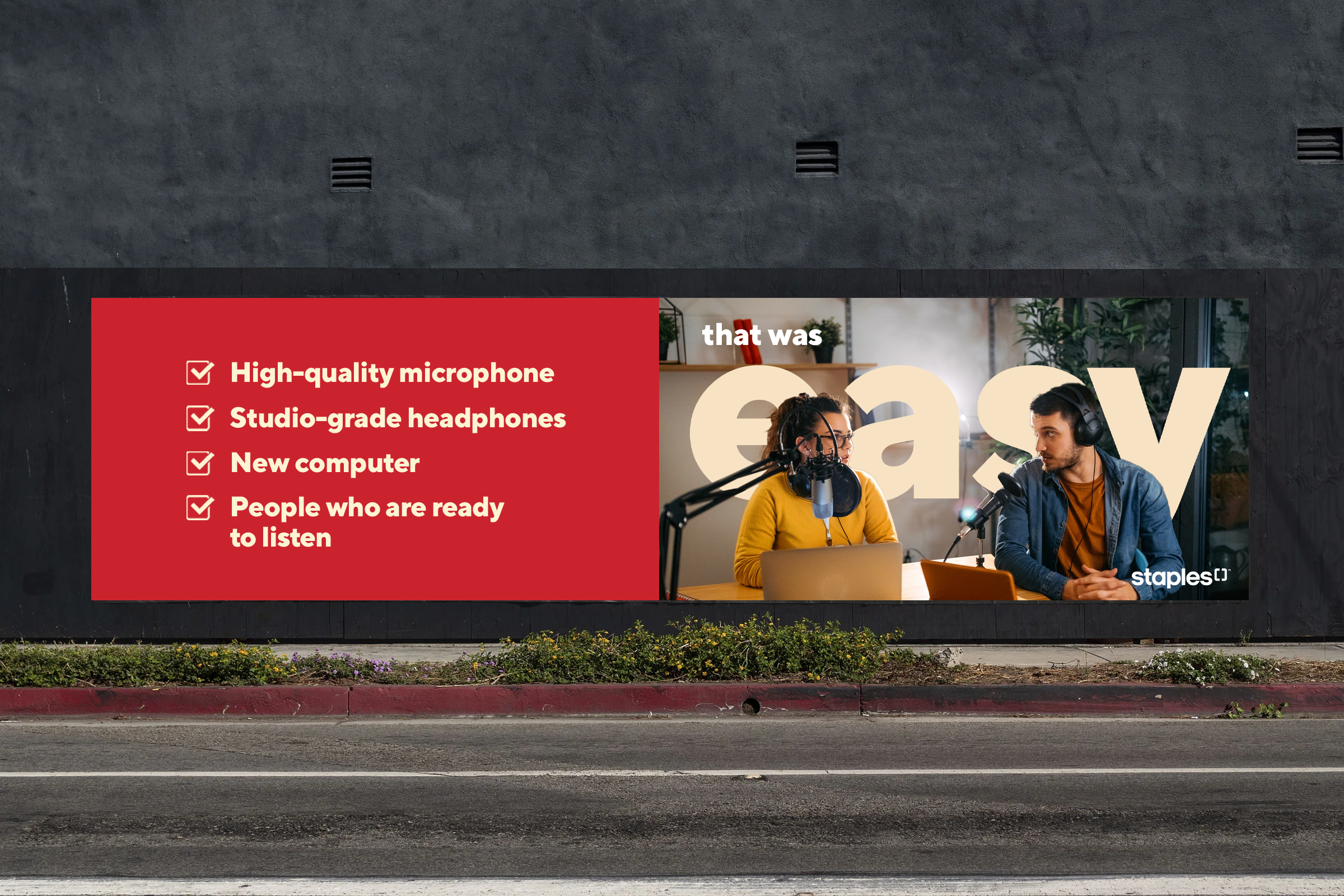
Direction 1: Icon Reinvented
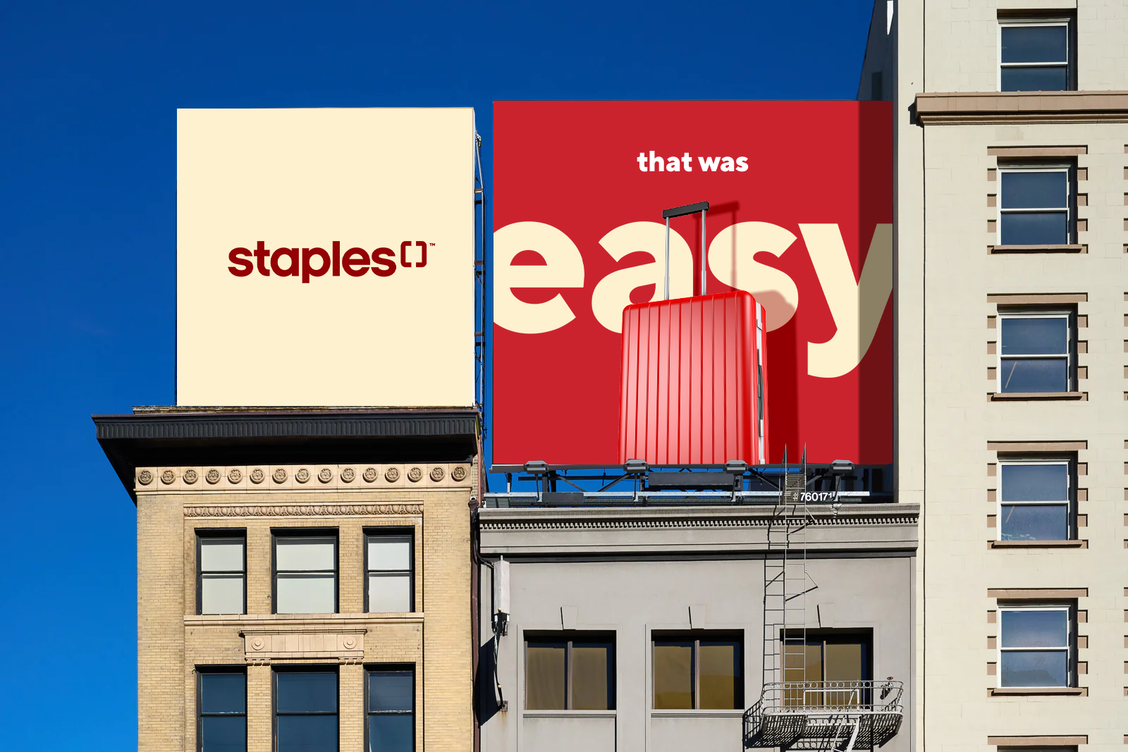
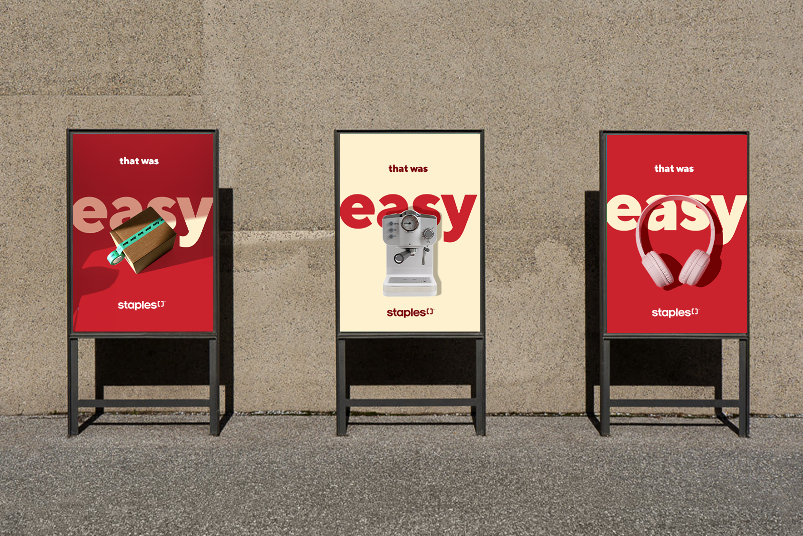
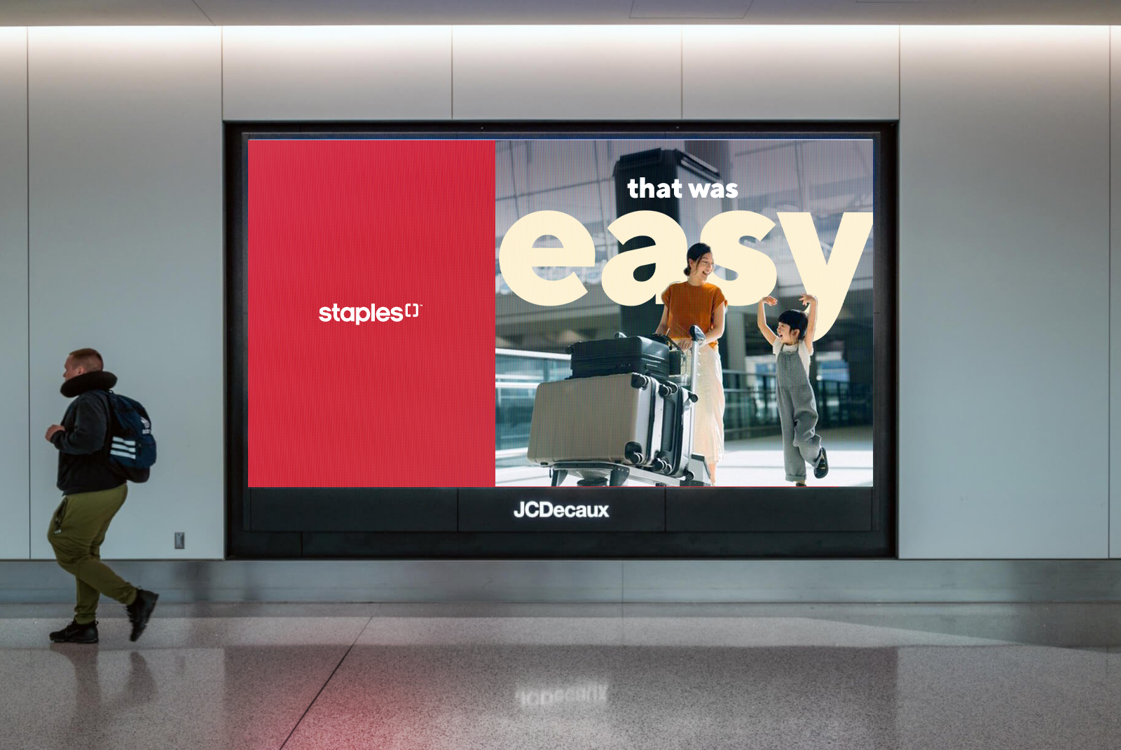
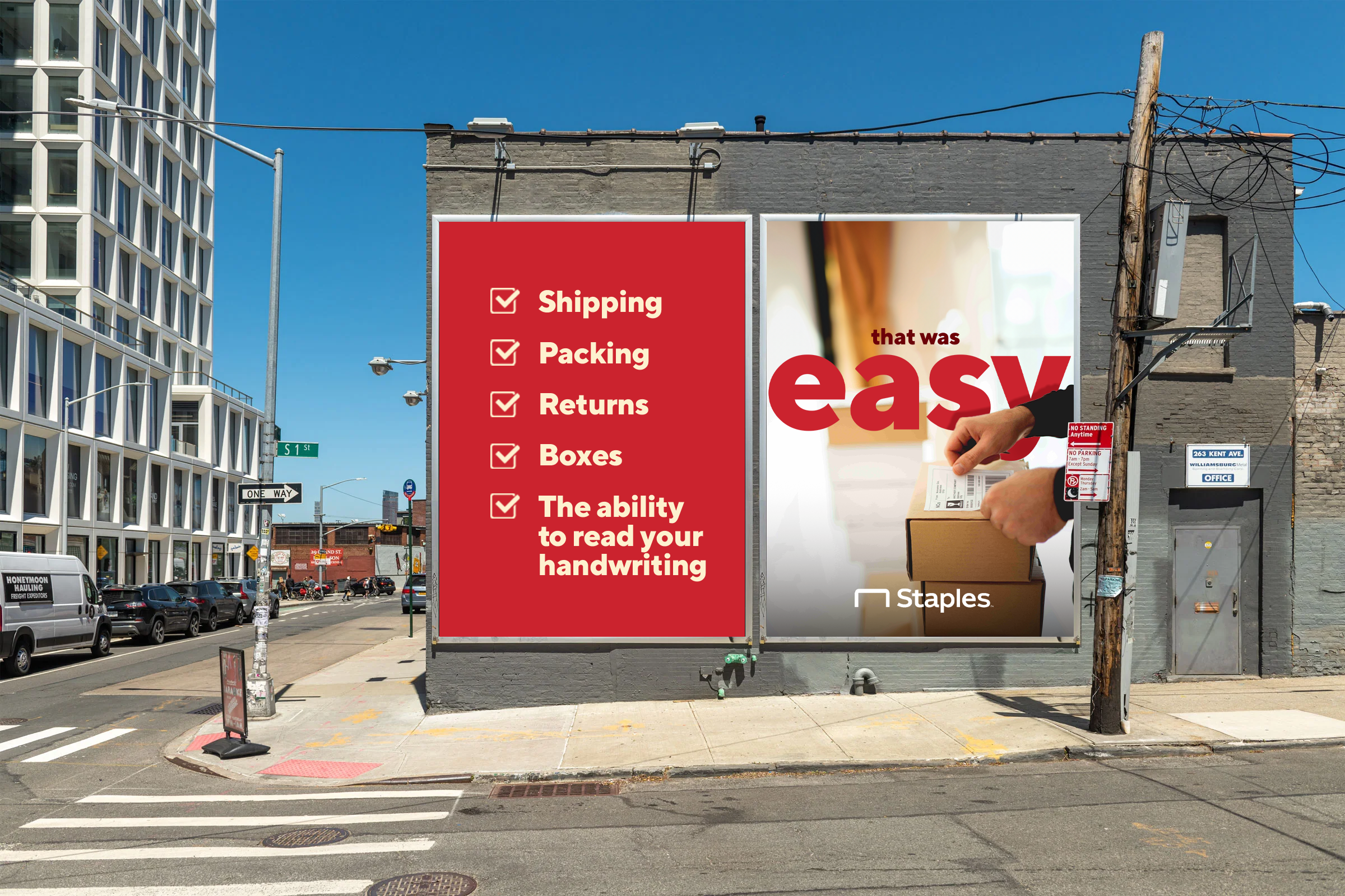
This was the selected direction—a bold, streamlined approach that placed the Easy Button front and center. We gave the button a modern design update, making it feel more current while retaining its iconic status. The campaign emphasized Staples’ simplicity and convenience by placing the button in unexpected environments, paired with the bold graphic declaration: “That Was Easy.” It reintroduced Staples’ signature red in a powerful way, using high-contrast visuals and oversized type to cut through the noise and reinforce brand recognition across all touchpoints.
Direction 2: Logo as a System
The second direction was more explorative and modular, using the Staples logomark (the bent staple) as a framing device. The staple icon became brackets, highlighting whatever Staples was making easier—products, services, or experiences. This system allowed for a more expansive color palette, assigning bold, distinct colors to different sectors of the brand. It was flexible, expressive, and designed for storytelling across a wide variety of contexts and platforms.
Both directions were crafted to evolve the Staples brand while staying true to its core promise. The final campaign brought new life to the Easy Button, positioning it not just as a symbol—but as a bold statement in today’s working world.


Direction 2
Turning the logo into a signal to customers that anything placed within it can be made [easy] at Staples.


